default version
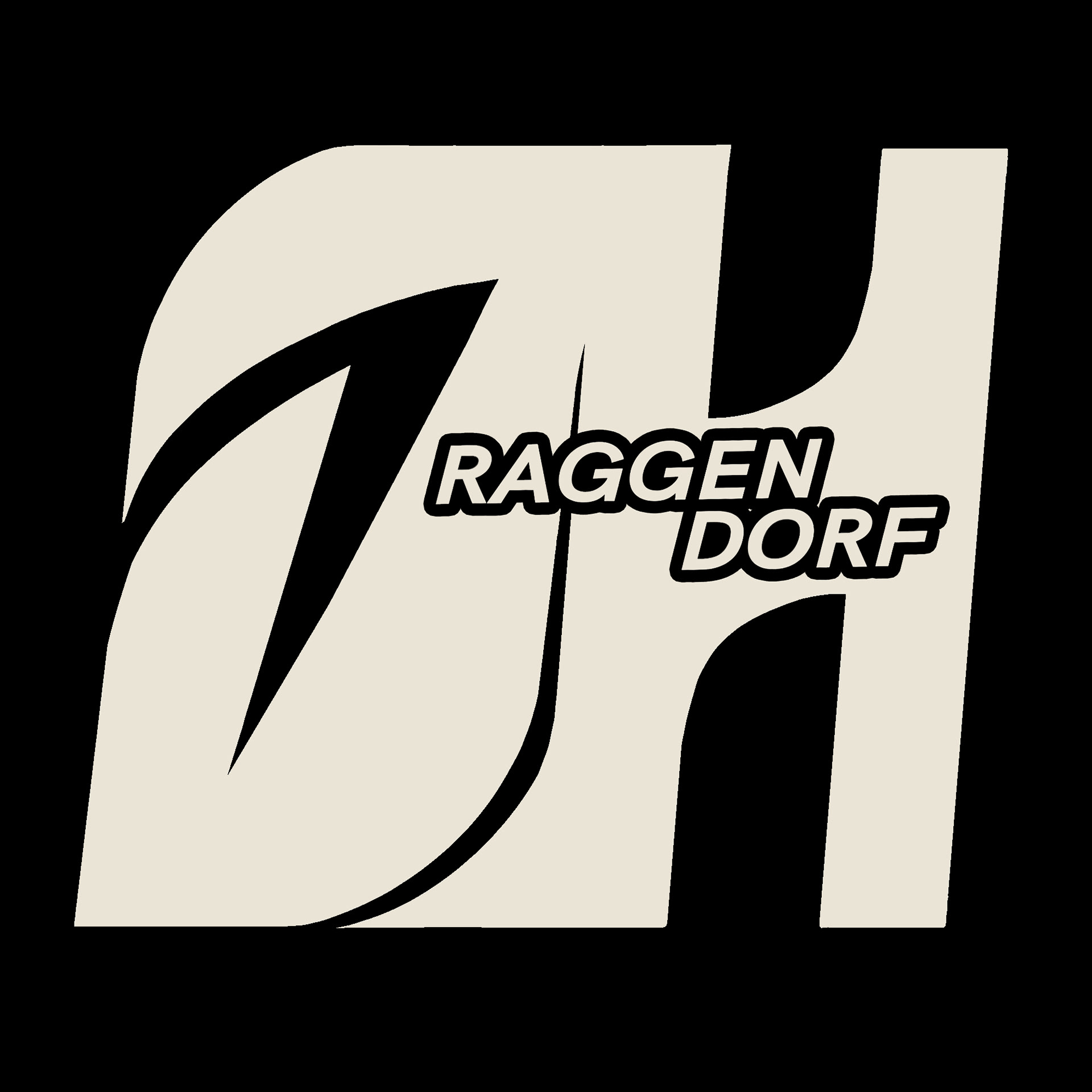
alternative version
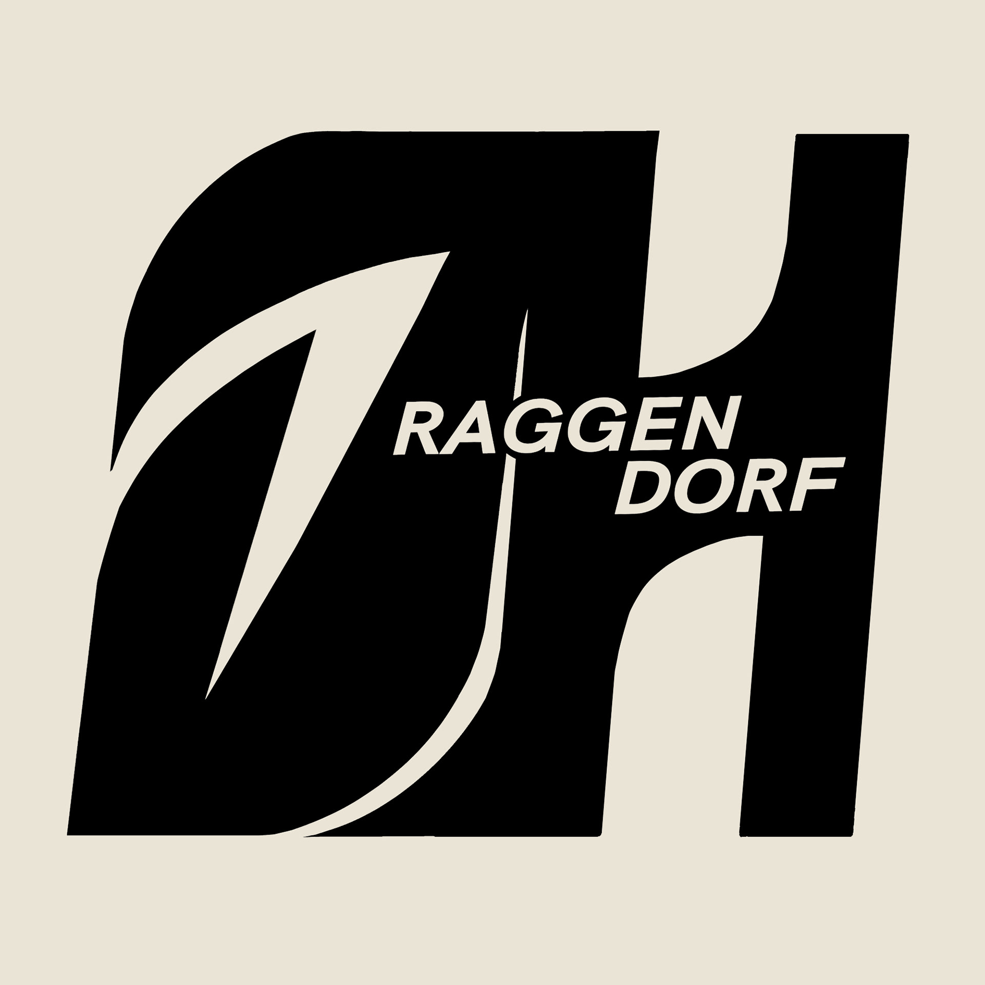
I was asked to design the logo for my local youth community - they wanted it to include the letters "J" and "H" as well as the name of the town. I came up with this dynamic design which embodies our community pretty accurately!